You fixed the layout. You made it mobile friendly. You even hired a designer to make everything look “premium.” But conversions? Still flat.
Let’s talk about something no one tells you: Most eCommerce websites don’t fail because they look bad. They fail because they ask too much from the customer’s brain.
Welcome to the real villain: Decision fatigue.
What is Decision Fatigue?
It’s when your brain gets tired of making choices. And when that happens, you either delay the decision or abandon it altogether.
In the world of eCommerce, decision fatigue shows up like this:
- Too many product options
- Confusing navigation
- Similar looking variations
- Endless scrolling
- Multiple CTAs on one screen
- Lack of a clear “next step”
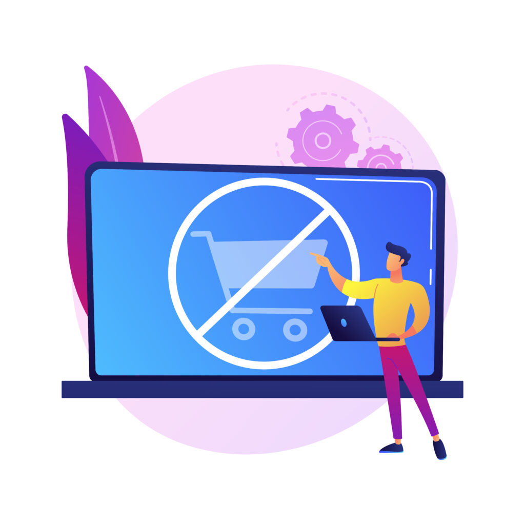
The result? visitors feel mentally tired. So they leave.
A Quick Stat Worth Knowing..
According to the Baymard Institute, the average cart abandonment rate is 69.99%. One of the biggest culprits? Overcomplicated user journeys and decision overload. Design isn’t just decoration. It’s a tool to reduce cognitive effort.
Where Your Site Might Be Overwhelming (Without Realizing It)
1. Mega Menus
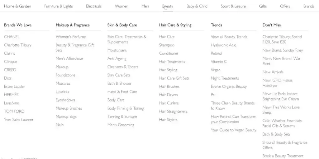
Menus with 20+ categories might seem helpful. But users can’t process that many options quickly.
Fix it: Group similar categories. Use progressive disclosure. Keep menus clean.
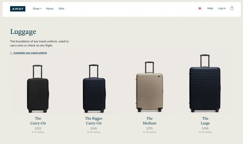
2. “Too Many Choices” Product Pages
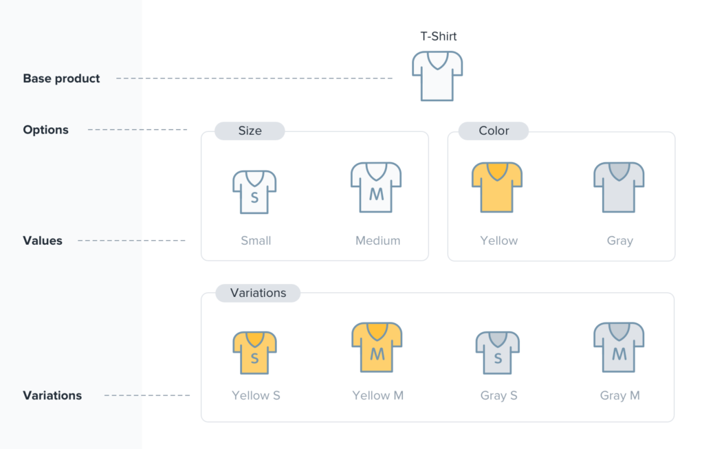
10 colors. 7 sizes. 5 bundles. You think you’re being generous. You’re actually exhausting them.
Fix it: Highlight a recommended choice. Use labels like “Best Seller” or “Most Popular” to guide decisions.
3. Unclear CTAs

“Learn More,” “Shop Now,” “Add to Cart,” “Subscribe,” all in one fold?
Fix it: Give them one thing to do per screen. Make it obvious. Make it easy.
4. Missing Visual Hierarchy
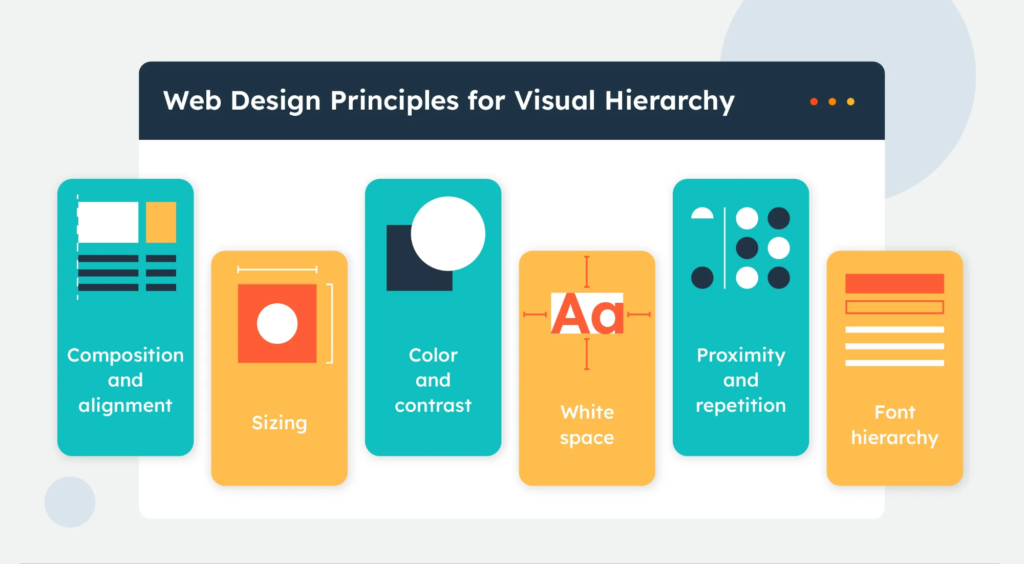
Everything looks equally important, so nothing stands out.
Fix it: Use font sizes, colors, and layout to guide the eye. Design isn’t just how it looks, it’s how it moves.
5. Paralysis at Checkout
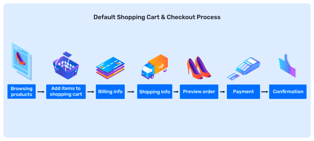
Do I need to sign up? Should I add a promo code? Why are there 4 shipping options?
Fix it: Simplify. Use auto-fill. Offer guest checkout. Save the upsells for post purchase.
Decision Fatigue Self-Check: Is Your Site Guilty?
Use this quick checklist to audit your store:
- Are there more than 6–8 items in your top menu?
- Do your product pages show 5+ options with no clear pick?
- Are there multiple CTAs on one screen?
- Is the checkout longer than 2 steps?
- Are users forced to create an account to buy?
- Does every element on your page compete for attention?
Your Score:
- 0–1: You’re streamlined and sharp.
- 2–3: Time to simplify.
- 4+: You’re making your visitors work too hard.
TL;DR – Simplicity Sells
When it comes to eCommerce, less is more.
Your job isn’t to impress. It’s to reduce the number of decisions a visitor has to make.
So next time you’re fixing your website, don’t just ask: “Is this designed well?”. Ask: “Is this easy to decide on?”
Final Thoughts
Design brings them in. Psychology makes them stay. Clarity gets them to buy. If your website is making people think too hard, it’s not doing its job. In a world full of choices, the real win is making your customer’s decision easy. Strip away the noise. Guide them with intent. And you’ll watch conversions rise, not because you added more, but because you removed the friction.
That’s the difference between a good eCommerce site and one that actually sells.